Friday, June 15, 2012

Station Fire

Station Fire - Los Angeles, 2009 

The fire that raged through the Angeles National Forest almost three years ago left a great deal of damage. The Station Fire is the largest fire in Los Angeles County's history, burning through 160,577 acres of national forest (NOAA, 2010). In addition to destroying over 150,000 acres of vegetation, it destroyed 18 homes and took the lives of two firefighters (Garrison, Zavis, Mozingo, 2009). The fire was not ignited due to natural causes but was the result of arson - a deliberate act of setting fire to the area. In the first map, titled "Station Fire Perimeters" a dynamic element of time shows how the fire spread. In a matter of 4 days it consumed a large portion of the Angeles National Forest and even posed a real threat to the cities of Glendale, Los Angeles and La Canada Flintridge with the flames licking at the northern tips of these populated areas. While the fire did a lot of damage, its devastating effects were felt long after the fire had been contained.
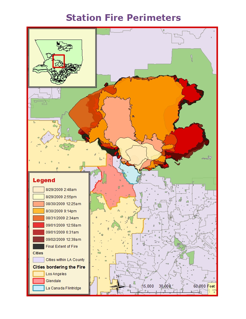
While there are many after-effects following the event of a fire, the most immediate effect is soil erosion. Soil erosion is not only a problem when trying to restore a burnt area, but can result in mudslides and flooding, which were exceptionally harrowing during the wet season the following year. According to the Los Angeles Times, several mudslides and floods affected hundreds of residents in Los Angeles County, with the brunt of the damage felt by residents in the foothills (Lin, Kim, Vives, 2010). In February of 2010, a mudslide damaged 43 homes in La Canada Flintridge and La Crescenta. It was so forceful it moved a 10-ton boulder, dented cars and did structural damage to a number of homes. Because soil erosion was one of the more extreme residual effects of the Station Fire, I decided to make it the focus of my theme map. 
 The map, titled "Post-Fire Soil Erosion Potential," is a spatial representation of how much soil erosion, measured in tons/acre/year could occur after a fire (FRAP, n.d.). The numbers were obtained by using the universal soil loss equation, which is A =R x K x LS x C x P. R is the rainfall/runoff factor; K is the soil erodibility factor; LS is the slope length gradient factor; C is the crop/vegetation and management factor; P is the support practice used. On the map, soil erosion is represented by a gradient, with the dark olive green representing high soil erosion (1981 tons/acre/year) and the light olive green representing low soil erosion (-1 tons/acre/year). Additionally, the final extent of the fire is outlined in a deep red solid line. It is clear that the soil erosion potential is extremely high in the burnt area, indicated by the predominantly dark olive green color. During the wet season following the Station Fire, all of the factors resulting in high levels of soil erosion were present, which led to the mudslides and the flooding in those areas. 


As a fire moves through an area, it burns the litter on the ground, the vegetation and even the roots of plants (Moench, Fusaro, 2012). Vegetation is responsible for mitigating the effects of rainfall and soil erosion. It absorbs excess water, reduces runoff and keeps soil in place. The presence of healthy vegetation is a crucial element in any environment, specifically one that is inhabited by people, because it can lessen and even prevent tragic flooding and mudslide events. After the Station Fire, the soil erodibility was high because soil structure was damaged, litter was non-existent and permeability was low. After being exposed to intense heat for a prolonged period, soil has a tendency to repel water. This is a condition called hydrophobicity (Moench, 2012). The slope length gradient was high because the burn area is located in a mountainous region with steep slopes. Vegetation was non-existant because it had been destroyed a few months earlier and rainfall was present and acute due to extreme storms. 


All of the elements were in place to create hazardous conditions that put the lives of residents living in the foothills and elsewhere at risk. According to the Los Angeles Times, unexpected storm conditions meant that the necessary evacuation orders had not been made, along with other precautions (Lin, Kim, Vives, 2010). While no lives were lost, damage could have been prevented if officials were more prepared. Funding should be allocated for restoration projects in burn areas, restoring vegetation to the area. Natural and artificial buffers should be created to deal with the after effects of fires, especially large scale ones such as the Station Fire. 


Works Cited 


FRAP Data: Post Fire Erosion Potential. (n.d.). FRAP - Fire and Resource Assessment Program. Retrieved June 9, 2012, from http://frap.cdf.ca.gov/data/frapgisdata/download.asp?rec=perod


Garrison, J., Zavis, A., & Mozingo, J. (2009, August 31). Station fire claims 18 homes and 2 firefighters. Los Angeles Times. Retrieved June 6, 2012, from http://articles.latimes.com/2009/aug/31/local/me-fire31


Lin, R., Kim, V., & Vives, R. (2010, February 7). 'Niagra' of mud hits homes. Los Angeles Times. Retrieved June 10, 2012, from http://articles.latimes.com/2010/feb/07/local/la-me-rain7-2010feb07


Moench, R., & Fusaro, J. (n.d.). Soil Erosion Control after Wildfire. Colorado State University Extension. Retrieved June 11, 2012, from http://www.ext.colostate.edu/pubs/natres/06308.html


State of the Climate | Wildfires | Annual 2009. (n.d.). NCDC: * National Climatic Data Center (NCDC) *. Retrieved June 11, 2012, from http://www.ncdc.noaa.gov/sotc/fire/2009/13


Sunday, May 27, 2012

Census Map Series

This map represents the Black population of the United States by percentage in each county. The legend is divided into six categories, each representing a certain range of percent population of Black individuals. From the map it is clear that a majority of the U.S. has a very low percentage of Black residents (between 0.010289 and 4.0%). The region with the highest population of Black residents is the South, according to U.S. Census regions and divisions. The region is categorized under the top 4 ranges, which means that between 12 and 88% of the population is Black. There are pockets of densely  Black populated counties throughout the Midwest and Southern rim of the Northeast as well.


This map represents the Asian population of the United States by percentage in each county. The legend is divided into six categories, each representing a certain range of percent population of Asian individuals. This map has less contrast than the Black population map. While it is clear that a majority of the U.S. has a very low population of Asian residents (0.005-1 %), counties with higher percentages of Asian residents are spread out throughout several regions of the U.S, such as the Northwest, Midwest, and Northeast. However, California undoubtedly has the largest concentration of Asian individuals indicated by the darker green and blue tones.


This map represents the "Some Other Race" population of the United States by percentage in each county. The legend is divided into six categories each representing a certain range of percent population of some other race individuals. According to the Census, the "Some other Race" category refers to individuals who identify themselves as multi-racial, interracial, mixed or Hispanic/Latino groups. While there are pockets of populated areas with a high percentage of "some other race" individuals scattered throughout the county, such as the Northeast, Florida, Illinois, etc, the Southwest as a clear concentration of "some other race" residents, which I believe is due to the large Hispanic/Latino populations in the region.

Overall, it was interesting working with Census data to create maps. I'm a very visual person and so it is an effective way to visually represent population percentages throughout the country. It was the first time we had to manually download data, input it into ArcGIS and join it with a preexisting map to create a model. While it was frustrating at first, not due to the difficulty level, but due to technical difficulties within the program, I learned a new and useful skill. The census data map series is a prime example of how attribute data can be turned into spatial representation within GIS programs.  It is an excellent way to present visual concepts that are based on solid data.

Tuesday, May 15, 2012

DEM Model


 3-D Model

Extent:
Left: -118.3375000009852 Decimal Degrees
Right: -117.6038888898247 Decimal Degrees
Top: 34.37416666576234 Decimal Degrees
Bottom: 34.08277777685384 Decimal Degrees

Coordinate System: Geographic Coordinate System North American Datum (NAD) 1983

I chose to create a DEM model of Mt. Wilson and Cloverleaf Canyon because it is one of the most visually striking physical features in Southern California. I thought it would make a good candidate for the digital elevation model. The high peaks of the mountain range and the low valleys of the canyon create a stark contrast in elevation which really showed up nicely in the models. In the 3-d model the high peaks are clearly visible (in white) and the lower canyon is green. Mt. Wilson is a part of the San Gabriel Mountains in the Los Angeles region and a part of the Angeles National Forest. It's highest peak is 5, 712 feet.

Monday, May 14, 2012

Map Projections


Equator: 435.767223 Decimal Degrees
Southern Graticule 143.839123 Decimal Degrees
Northern Graticule: 188.049757 Decimal Degrees

Geodesic: 100.364186 Decimal Degrees
Great Elliptic: 100.364268 Decimal Degrees
Loxodrome: 117.061322 Decimal Degrees


Map Projections

A map projection transforms the 3-d globe into a 2-d surface.  A projection cannot preserve all of the features of the globe, such as distance, direction, area, and shape because it takes spherical coordinates (x,y, and z) and transforms them into 2-d space (x, y).  Consequently, some error/distortion is introduced and each map projection contains certain errors. This is why maps are typically named after the features they do preserve - such as equidistant or equal area.

Map projections are critical to GIS projects. You need to choose the right projection depending on your research in order to achieve accurate results. For example, if your study focuses on the distance between features, cities, etc, it is critical that you use an equidistant map, such as azimuthal equidistant or equidistant conic (first two projections). These maps preserve distance and will give you accurate results. If you chose a projection that does not preserve distance, such as Mollweide or Mercator, your results would be inaccurate and would impact all your research and data information. A projection is the most basic, fundamental component of any GIS project and shapes the results.

The first two projections preserve distance from some standard point or line. I chose World Azimuthal Equidistant and Sphere Equidistant Conic. With the former, distances and directions to all places are true only from the center point of projection. Distances are accurate between points along straight lines through the center; all other distances are inaccurate. Distortion of areas and shapes increases the further away you get from the center. For example, in the Azimuthal Equidistant map, Antarctica is tiny and not at all true to its size. 


The next two projections preserve area which means that the images on the map are proportional to the area of the landforms they represent. I chose the Cylindrical Equal Area and Mollweide. These equal area maps are useful for calculating the area of countries, continents, etc. They give you an accurate representation (area) of the world. If you were to use an equal area map to figure out something else, such as distance, it would be inaccurate, which is clear from different distances between Kabul and Washington D.C. 


The last two projections are examples of conformal maps, which preserve shape by preserving the angles of feature boundaries, such as countries or continents. By preserving the angles, the area within the features is distorted. For example, in the first conformal map (Mercator projection) the shape of Greenland is accurate but is dramatically larger than it actually is. If you referenced the equal area maps, you would see that Greenland is actually the size of Mexico.Additionally, conformal projections do not preserve the shapes of features that are close the poles (ex. Antarctica). Conformal projections are useful for navigating angles/traveling (via boat/airplane). 


Clearly, the potential of map projections is huge. There's a map projection for your spatial needs, whatever they are. The only thing to be weary of is the sensible and knowledgeable selection of the map projection that will give you accurate results. This requires some knowledge about map projections, including the different types and which features they preserve. 

Tuesday, May 8, 2012

ArcGIS map


ArcMap

Using ArcGIS for the first time was confusing and a little frustrating, but rewarding in the end, after creating the final poster. The tutorial was a little outdated, and while the significant changes were noted in the lab instructions, a lot of things were aesthetically different, which took more time to figure out. I had never used a GIS program in the past, so I was entirely unfamiliar with the tools and capabilities of the program. At first everything was foreign and I didn't even quite understand how to operate the zoom in/out and pan buttons but after a while I got the hang of it. By the end of the tutorial, it instructed me to repeat a lot of processes that I had completed earlier. I thought I would have to refer  to the step-by-step instructions, but I was actually able to utilize the tools and execute the steps just by relying on memory.

There were some technical glitches, such as the legend key and scale bar vanishing from one of my maps and trying to decipher some complicated steps that were not detailed enough. For example, I had to export data files and save them to the Map file on my flash disk, which I had never dealt with before. I believe that a more tech savvy individual would definitely not have had such problems, however. My difficulties were most likely due to the fact that I am a little technologically challenged. Other than that, the tutorial was clear and detailed. It was a good introduction to such a complex program, highlighting a lot of key features that will undoubtedly be useful in the future.I definitely learned a lot and believe it will be a lot easier and less frustrating as I use the program more.

I like the fact that ArcGIS can be used to handle all of the subsystems of GIS including data input, preprocessing, analysis and output. It makes the experience much more convenient - especially the fact that you can switch easily from data view to layout view. This definitely makes it a dynamic and flexible program. The spatial and attribute components together definitely make for a powerful tool for analyzing datasets. In addition to organizing and analyzing, the information can be made presentable (such as the above poster) and used to present ideas to decision-makers.

I also realized what all my friends minoring in GIS mean now! It is a very time-consuming process, which is a drawback. It definitely took me longer than I expected to complete the tutorial and I can understand how it could be a tedious process: gathering data, converting files, organizing and presenting information. If one was not well trained or educated it could be a very daunting task. Another thing to be weary of is that data, no matter how objective or factual, can be biased. So all the information you gather from a certain data set can be colored by it. That's why it is important to understand the intent of the research, or clearly figure out your own objectives. Lastly, the program itself does not run perfectly, just like any other software, so it is important to save your work on a regular basis and try not to get frustrated with minor technical difficulties.

Monday, April 30, 2012


View Vegetarian Restaurants in East Hollywood in a larger map


Potential, Pitfalls, and Consequences of Neogeography 


Neogeography is the new frontier: mapmaking just got personal. Neogeography has huge potentials, which are clearly evident from the burst of location-based, mobile-app "tagging" and map making from every day people. Common individuals are being exposed to and utilizing tools that were once reserved to highly trained and educated individuals. Now, anyone, even a child, can log into Google, make a map of their choosing and post it for the world to see. One benefit is the informal education of the public on maps and the knowledge that comes along with it. Neogeography also serves as a social service, providing essentially everyone and anyone who has access to the internet with thousands upon thousands of maps of anything you can imagine, from hiking trails, to popular tourist spots to.. Vegetarian Restaurants in East Hollywood! Neogeography is made by individual, everyday people, but it can help and guide thousands of users on the internet. Neogeography is also a very powerful mapping tool on a local scale. People can make maps of their neighborhoods and towns, which can be used to warn people about dangerous areas, areas without lamp posts, etc. 


While this is a great product of Web 2.0, there are also a lot of pitfalls and consequences. Lack of privacy, inaccurate data, and misleading maps are all issues. With GoogleEarth, everything is public. "Gated" and "private" neighborhoods are a thing of the past: anyone can download Google Earth and view someone's neigborhood, street, or even backyard with a few clicks. Another large pitfall is the lack of precision and accuracy. Because people with no professional training in GIS or cartography are using these programs, a lot of information can be false, not fully researched, or even intentionally misleading. 

Tuesday, April 10, 2012

Beverly hills map

1. Beverly Hills Quadrangle
2. Names of adjacent quadrangles: Canoga Park, Van Nuys, Burbank, Topanga, Hollywood, Venice, Inglewood.
3. The quadrangle was first created in 1966.
4. North American Datum from 1927 and 1983 were used.
5. The scale of the map: 1: 24 000
6. At the above scale, answer the following questions:
a. 1200 meters on the ground
b. 1.8939 miles on the ground
c. 2.65 inches on the map
d. 12.5 cm on the map
7. contour interval is 20 feet
8.Approximate geographic coordinates in both degrees/minutes/seconds and decimal degrees
a. PA building: 34º 4' 30'' N 118º 26' 15'' W or 34.075º N 118.438º W
b. tip of santa monica pier: 34º 0' 30'' N 118º 30' 0'' W or 34.008ºN 118.5º W
c. upper franklin canyon reservoir 34º 6' 25'' N 118º 24' 40'' W or 34.107ºN 118.41ºW

9. Approx. elevation in both feet and meters of:
a. greystone mansion: 560 feet or 170.69 meters
b. woodlawn cemetery 140 feet or 42.67 m
c. crestwood hills park 620 feet or 188.98 m
10. UTM zone: Zone 11
11. what are the UTM coordinates for the lower left corner of your map?
3,763,000m northing 362,000m easting
12. how many square meters are contained within each cell (square) of the UTM gridlines? 1000 meters squared
13. Elevation Profile

14. what is the magnetic declination of the map? 14 degrees
15. In which direction does water flow in the intermittent stream between the 405 freeway and Stone Canyon Reservoir?
South
16.